


TYPE
Mobile Interface
Personal Project
TEAM
Individual
TIMELINE
6 Weeks
Jan - Mar 2024
TOOLS
Figma
Maze
Excel
Zoom
Smart Design, Sustainable Solutions
OVERVIEW
Food waste is a pressing global issue with many consumers struggling to manage their food inventory effectively, leading to waste, missed expiration dates, and difficulty connecting with local food-sharing initiatives.
This led me to ask:
How can good UI encourage easy food waste management?
To tackle this, I designed the Green Beans app, which aims to help users minimize food waste by providing recipe suggestions based on available ingredients, sending expiration reminders, and connecting users with local food-sharing initiatives to promote a more environmentally responsible community.
This project was inspired by the growing concern about food waste and its environmental impact, and my involvement with Green Campus Cooperative, a Toronto-based non-profit organization focused on sustainability.
MY ROLE
For this individual project, I was responsible for all design aspects including wireframing, prototyping, conducting usability tests, and user interviews.
WHAT I ACCOMPLISHED
+ Addressed pain points in food waste management through user-centric features to promote sustainable and mindful consumption habits.
+ Identified friction points in the design and user experience by conducting usability tests and user interviews.


THE PROCESS
How Did We Get Here? (Click to Enlarge)


PHASE 01. DESIGN KICKOFF
⬇️ Let's Break it Down
Identifying the Problems and Pain Points
-
Users struggle to meal plan with their available ingredients, leading to food waste, and they often overlook expiration dates and have trouble finding local food-sharing initiatives.
Potential App Users
-
Parents: Reduce food waste by meal planning, using leftover ingredients, and donating excess food.
-
Students: Save money by meal planning and using leftover ingredients.
-
Individuals wanting to make a change: Address environmental concerns by reducing food waste.
Reason for Investigating this Problem
-
My involvement with Green Campus Cooperative, an organization dedicated to promoting sustainability and responsible consumption, inspired me to investigate the issue of food waste.
-
Given GCC's focus on environmental and social aspects, food waste is a prominent topic within the organization.
How Can UI Solve the Issue?
Enable users to:
-
Discover and connect with local food-sharing initiatives for donating excess food or volunteering.
-
Search for personalized recipes based on their available ingredients to reduce food waste.
-
Receive timely notifications alerting them to expiring food items in their fridge or pantry.
-
Create and manage personalized grocery lists to avoid unnecessary purchases and minimize food waste.
BRAINSTORMING SESSION
Fueling Innovation and Discovering Solutions
To jumpstart this project, I collaborated with two colleagues to conduct an initial Crazy 8s brainstorming session. This activity stimulated creativity and helped me explore different ideas. I gained great feedback and design suggestions which enabled deeper discussions to help me develop my initial ideas and get introduced to new ones.
From the sketches I received, I narrowed down five potential ideas for addressing the problem:
01. FOOD SHARING/DROP-OFF:
A location-based resource to find nearby food-sharing initiatives including maps, hours, and accepted items.


02. RECIPE OF THE WEEK:
A feature that generates recipes based on ingredients users already have, helping to minimize waste.


03. TIPS FOR FOOD SAVING:
A page offering methods to prolong the life of grocery items and manage food waste.

04. FOOD INVENTORY/EXPIRATION:
A visual list of grocery items with expiration dates, including suggested recipes to use them up.

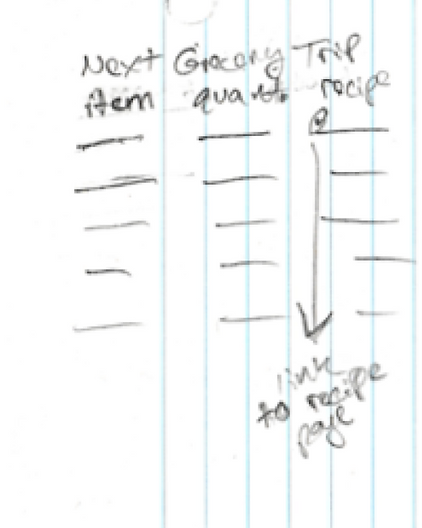
05. NEXT GROCERY TRIP:
A planning tool for organizing grocery lists to avoid excess purchases, linked to suggested recipes for each item.


PHASE 02. USER FLOWS
After gathering key concept ideas, I began to map out the flows of each app feature to help visualize the user journey, identify issues, and ensure a logical and intuitive user experience.
USER FLOW LEGEND:

USER FLOW #1: 'NEAR ME' PAGE
(Click to Enlarge)

USER FLOW #2: 'INVENTORY TRACKER' PAGE
(Click to Enlarge)
USER FLOW #3: 'GROCERY LIST' PAGE
(Click to Enlarge)

USER FLOW #4: 'EXPLORE' PAGE
(Click to Enlarge)

USER FLOW #5: 'RECIPES FOR YOU' PAGE
(Click to Enlarge)

PHASE 03. LOW-FIDELITY WIREFRAMES
After completing user flows, I sketched low-fidelity wireframes to quickly explore and iterate my design ideas to help identify potential usability issues early in the process.
HOMEPAGE NAVIGATION:
(Click to Enlarge)

NEAR ME PAGE:
(Click to Enlarge)

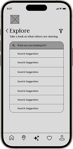
EXPLORE PAGE:
(Click to Enlarge)

PHASE 04. MID-FIDELITY WIREFRAMES
Next, I created mid-fidelity wireframes to outline a more detailed and interactive representation of the design. These were used for early usability testing, feedback, and ensuring the design aligned with the goals.
HOMEPAGE NAVIGATION:


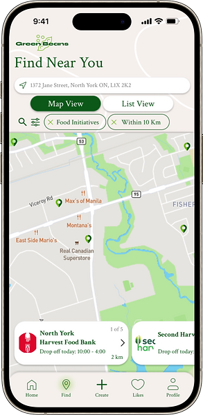
FIND NEAR YOU PAGE:


EXPLORE PAGE:

PHASE 05. USABILITY TESTING - OBSERVATIONAL SESSION
🧠 Understanding User Behaviour and Usability
During this phase of the project, I conducted 3 usability tests and observational sessions via Zoom, where I guided
participants in real-time through different mid-fidelity screens to complete various tasks; gathering some great feedback to help enhance Green Beans.
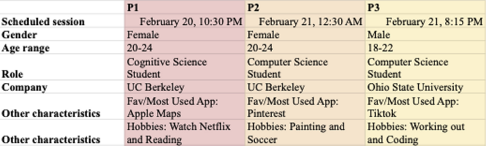
👥 Getting to Know the Participants
I recruited 3 participants from my personal network, aiming for students.
🔍 Analysis and Key Takeaways
Participants were able to navigate through my mid-fidelity prototype easily, and after analyzing all the feedback received, I was able to see patterns and areas where improvements could be beneficial:

⬇️ Further Breakdown

Clarify app purpose with an image or tagline.
WELCOME PAGE/SIGN-UP PROCESS
Add a "resend code" button for verification.
Include a page for users to select their interests.
Specify verification method (email or text).
NAVIGATION & USABILITY
Maintain highlighted icons for navigation.
Reorder homepage tabs for better accessibility.
Implement rotating greetings on the homepage.
Place 'Create' and 'Recipe' tabs together.
Enable redirection to Google or Apple Maps.
'NEAR ME' PAGE
Move location bar to the top of 'Near Me' page with "precise location" button.
'EXPLORE' & 'LIKES' PAGE
Add eye-catching images/recipes to the Explore page.
Display search suggestions below the search bar.
Introduce a "Plus" button for creating custom sections on the Likes page.
Incorporate filtering options for pictures and videos on the Likes page.
Implement a double-tap feature for liking content.
Allow users to sort content by likes, popularity, etc.
Move "Explore by category" higher on the screen.
Expand category options beyond cuisines.
RECIPE PAGE
Include macro information on recipe pages.
LIST ORGANIZATION
Allow users to sort lists alphabetically and by categories.
Include a section for grocery store names in lists.
PHASE 06. USABILITY TESTING - TASK SCENARIOS & DESIGN ADJUSTMENTS
After conducting the initial usability testing, I leveraged the feedback to create a high-fidelity mockup. This session helped me identify usability issues, gather user feedback, and validate design assumptions to ensure a more positive and user-friendly experience.
Tested Prototype

User Testing Methodology
TESTING TOOL:
RECRUITMENT: I recruited the original 3 usability test participants to foster a sense of investment in the new design.
Usability Testing Scenarios

SUCCESS CRITERIA: Sign up for the app.
TASK: From the app's welcome screen, sign up and continue.
*This will measure the time efficiency.
SUCCESS CRITERIA: Search for nearby food initiatives and select one.
TASK: Navigate to the ‘near me’ page and view nearby food initiatives in list view. Navigate to map view and select the first location option.
*This will measure the time efficiency and navigation.
SUCCESS CRITERIA: Explore a category and add a post to 'likes.'
TASK: From the explore page, look for “recipes" and demonstrate how you would add the first post to your likes.
*This will measure the usability and navigation process of explore page.
SUCCESS CRITERIA: Create a new post.
TASK: Starting from the explore page, demonstrate how you would create a new post to add to the explore page.
*This will demonstrate how easily users can find option to create new post.
SUCCESS CRITERIA: Create inventory list and set an expiration reminder.
TASK: Start at the explore page and demonstrate how you would create a new inventory list for your kitchen. Select the first list on the page and set an expiration reminder for the last item on the list.
*This will demonstrate how easily users can add items to the list and set expiration reminders.
🚀 Actionable Insights
-
The usability test revealed that while the signup process and post-creation were successful, users struggled with finding local food-sharing initiatives and creating inventory lists.
-
The 'create' tab and list buttons could be improved for better navigation. Additionally, the inventory page needs clearer instructions for adding expiration reminders.
🔄 Design Adjustments

ORIGINAL DESIGN

This would allow users to visually see and read where they need to add an expiration date for their item.
DESIGN ADJUSTMENT

ORIGINAL DESIGN
The plus icon can be moved to the explore page for better usability and easy access and navigation.

DESIGN ADJUSTMENT
This design adjustment would allow for better accessibility as the icon better reflects the action.
PHASE 07. FINAL DESIGN & STYLE GUIDE
Through various phases of brainstorming, designing, and testing, the final design of the Green Beans app offers user-centric features that effectively assist and encourage sustainable and mindful consumption habits, and develop collaboration with local communities and initiatives to reduce food waste.
Sign Up Page
Users can quickly sign up for the app and get into the homepage.


Homepage
Users can view notifications and explore various recipes, tips, and blogs that can be favouritied or reposted.
Create Page
Users can efficiently create their own posts directly from the homepage


Find Near You Page
Users can seamlessly locate food-share initiatives and produce
near them to either drop off excess food items or find stores with overstock or upcycled ingredients at a discounted price.
Lists Pages
Users can create custom lists including grocery lists and pantry and fridge lists to keep track of inventory and expiration dates.


Likes + Profile Pages
Users can revisit and sort their favorited content including recipes, tips, and posts. The profile page allows users to access settings and personal information.
Design Mood Board

Design Style Guide


PHASE 08. LESSONS LEARNED 🎓
Key Project Takeaways & Lessons Learned
User Testing is Crucial
-
User testing is crucial for validating assumptions, identifying usability issues, and ensuring the design meets user needs. It's essential throughout the product's lifecycle for ongoing improvement.
Collaborative Brainstorming Proves Invaluable
-
Collaborative brainstorming fosters diverse perspectives and generates more ideas.
